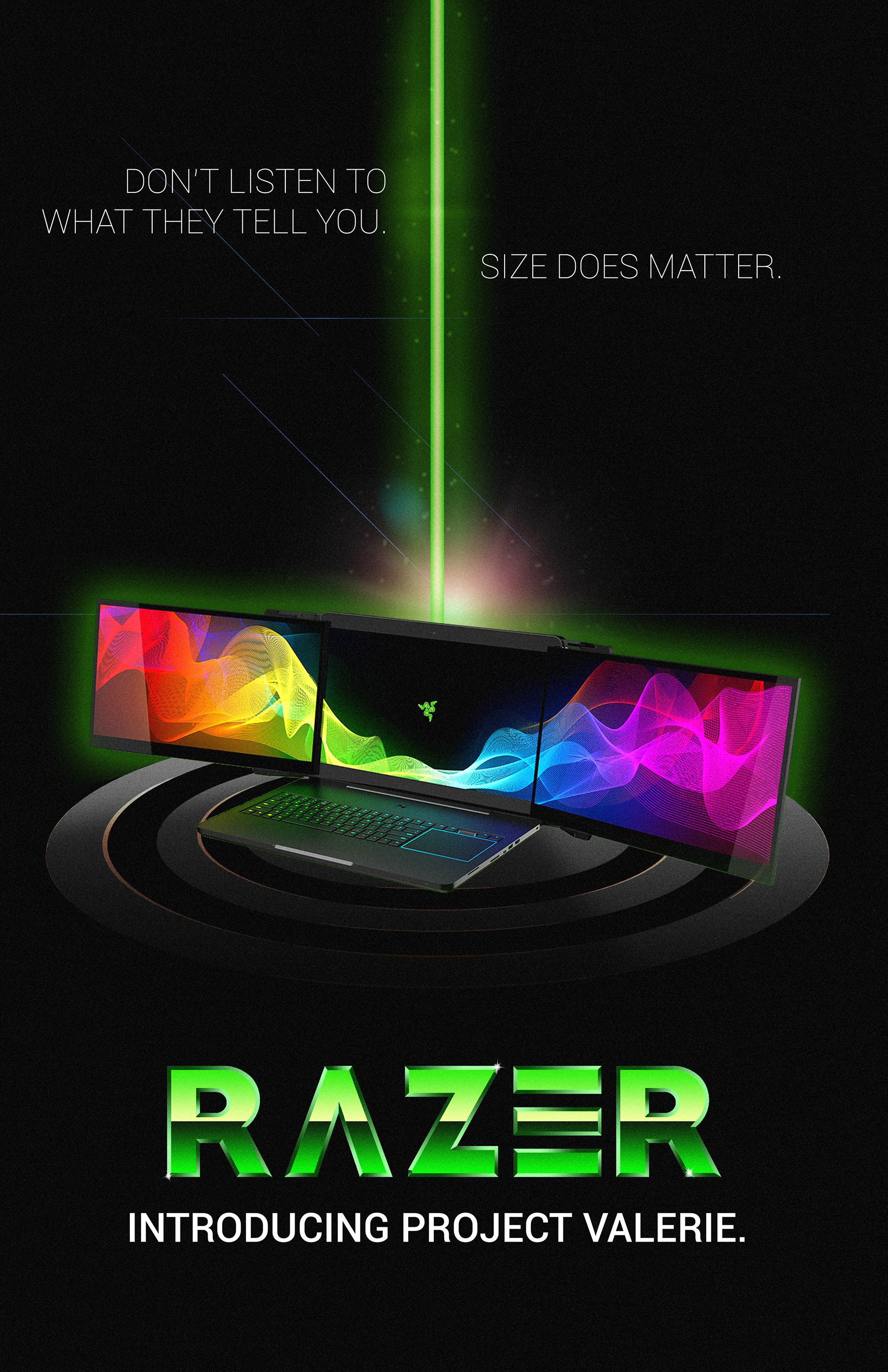
A hypothetical project. We were tasked with taking something currently existing and doing a rebrand. I'm really into the recent rise of the 80s look and style, so I wanted to take something modern and put it back in time. I chose the company Razer, since they're very modern and clean with their style. I took the logo and turned it into a sort of 80s metal style look. I started with a basic font and customized the outlines, gradients, and font style (the custom A and E) myself.


For the posters, I looked at old 80s tech posters or movie posters and tried to make posters that gave similar vibes, all using their prototype three monitor laptop. I tried to ensure that the posters were all unique and showed off a different style and my capability to create different styles while staying in the same brand and not being out of place.
This is a 3D package design I did using a combination of Photoshop and Substance Painter, I took the UVs from a simple box and created the basic layout, the logo and the name of the product underneath, and then decided that since Razer is so heavy on the RGB and color in their branding, thought a rainbow band would add some nice flavor. I then took all of that into Substance Painter and added some more texture and weathering to the box so it would feel a little more real and less immaculate, like the box was weathered from the 80s.
