This was a concept project, we were given randomized names made of two random words and then we had to create an identity for this fictional company. For Minimal Dragon, I made them into an upscale interior design firm. The word minimal went perfectly with my style, so I used that to my advantage in creating a simple logo, connecting the letters and using the D as a dragon's tail (logo designed in Illustrator).


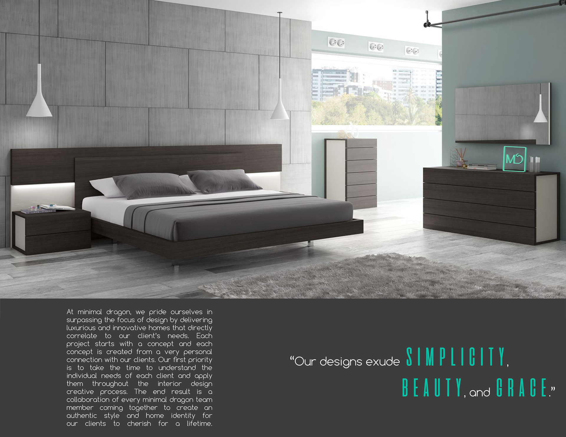
A brochure that went along with the design. A brochure was a perfect thing for an interior design firm, it felt like something that might be on their lobby front desk, and it is a good way to showcase what this fictional company might look like if you were to be interested in their services. Continuing with the minimal theme, I wanted to emphasize their work and ensure there wasn't clutter or excessive text.
Poster for the company. This was tough but fun, the most difficult part was finding a dragon tail that I could cut out that would look how I wanted it. To get the best results possible I would probably have to model an entire 3D dragon tail and render it to add in to the image, but for the sake of the project that would have been far too time consuming. Again, going for a simple look that still keeps with the company's theme and name and gives that association easily, so it keeps the dragon concept along with a simple but elegant room design.
